

Mixing patterns in your home is a great way to add color, interest and depth! It is also my favorite way to give it that custom touch and make it 100% your own. While so many want to be able to achieve that perfect balance in their patterns, it can be a little daunting. I want to share some tips to ensure that you can get that designer feel on your own! Keep in mind, as a Designer, I love breaking rules, so think of these as basic guidelines to ensure that you get it right the first time.
Today, we are going to work as if though we are designing a living room space and we will primarily focus on a sofa. While all of the fabrics I’m sharing with you could easily go onto one sofa, they most definitely could be spread out around your room as well. An accent pillow on a chair, a dab of color thrown over the top of a blanket basket… You get the drift! And while there certainly is an art to mixing patterns, we’ll just go over five basics that anyone can master! If you love it, let me know and I will write up or do a short video on getting a little more in depth, taking your space on step further!
GUIDELINES FOR BEGINNERS
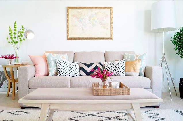
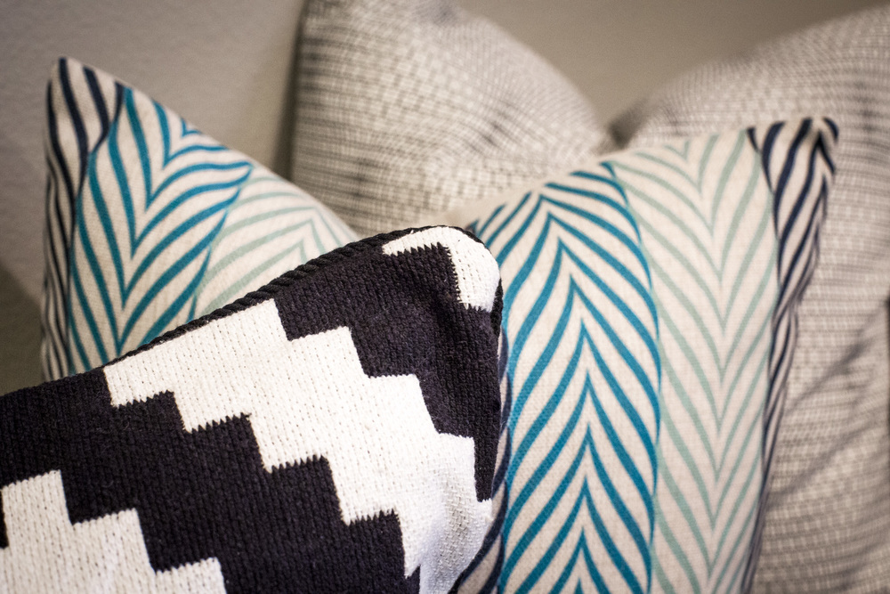
1. Your largest pattern is best on your largest piece. Some put their largest pattern on their floor via an area rug. Some put it in their print on the draperies. But, for this tutorial, we’ll strictly be talking pillows. So, a major key in getting the pillows right on your sofa or sectional, is choosing different sizes of pillows for your furniture piece and allowing your largest pillows to don the largest of your patterns. A good rule of thumb for the sizing of your pillows is 22″ square, 20-18″ square, and 18″-16″ square pillows. Varying the sizes allows for the viewer to really see all the prints and patterns presented.
2. Vary the scale of your patterns. While I don’t often mix two floral patterns together, you can get away with it if one of those patterns is an extremely large, open print, and the other is a very small, uniform print. The key to any great design really is getting scale and proportion right and where that applies to furniture and decor, the same reigns true for mixing patterns. You can mix two of the same style of pattern, it just needs to be a dramatically different size.
3. Stick with a consistent hue. Working exclusively with brights, neutrals, or jewel tones, etc. will help you immensely. It’s fun to play around and mix them up once you have a really good feel for getting your scale and pattern down to a science, but to get started, staying within a palette will be great practice to getting it right.
4. When in doubt, throw in a solid. If you’ve got your large scale pattern, and small graphic picked out, yet you still can’t seem to get that third pattern in between just right, go with a solid. Pick a color out that you love and ties the other two together and you just can’t lose! The best part of going with a solid, is that even if you eventually found another print to mix into your patterns, solids can usually find a home pretty much anywhere! My insider designer tip when going with a solid, try a crushed velvet! It always looks rich and expensive and has tons of texture and movement all on its own!! Velvets come in tons of colors, so many colors in fact, I wish you luck picking one out!
5. Let your large pattern dictate your color palette. This large print, that we now know we are going to put on our largest patterned piece or pillow, is a wonderful tool to help you drive your entire rooms look. If you want to achieve a tailored, monochromatic space, select a beautiful, bold print that has a multitude of values in the color you’re sticking with. If you want a playful room with a lot of color, select a print that is full of life and texture.
MAKING IT HAPPEN
Time to show you how to make it happen! I’ve broken some examples down into some aesthetic groups that I love to help make it easier to grasp how to accomplish “looks” inside your home. If there’s a certain style or look you’d like to achieve thats not below, feel free to leave a comment and let me know!
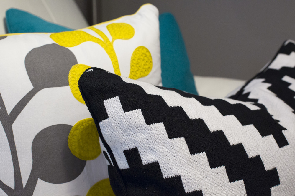
MODERN MONOCHROME
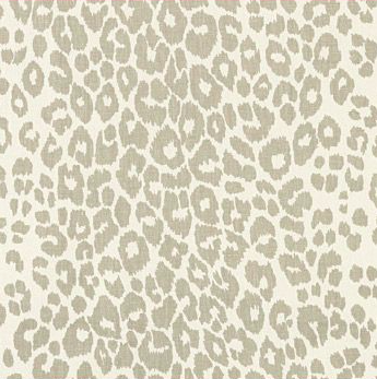
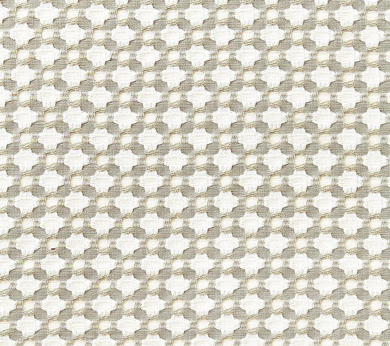
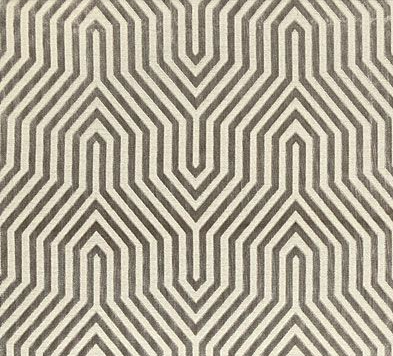
I love monochromatic spaces! In this palette, we are going to let our large scale pattern set our stage. It’s so very important when you’re designing minimal spaces to use dominant patterns such as fabric one to avoid the space from getting boring. Our second pattern is a playful animal print that is of medium scale. Animal prints are classic and tend to work with whatever the style you’re trying to accomplish! The variance of values in this particular animal print really goes from the dark end of our color spectrum all the way to the lighter end. The third is a small scale geometric. This is still visually interesting and adds a lot of texture to this pattern mix. The fourth pattern is another medium scale pattern in a luxury fabric. It includes our darkest color here and our medium neutral color. This is really the gem on top and adds a lively punch to the grouping!
Styling – If I were styling a sofa with these patterns, I would go for a balanced, sophisticated look. I would have two large 22″ of the first pattern, two 20″ of the second pattern, two 18″ of the third pattern, and one of the luxury print in a lumbar pillow to finish it off! Yummy!!!
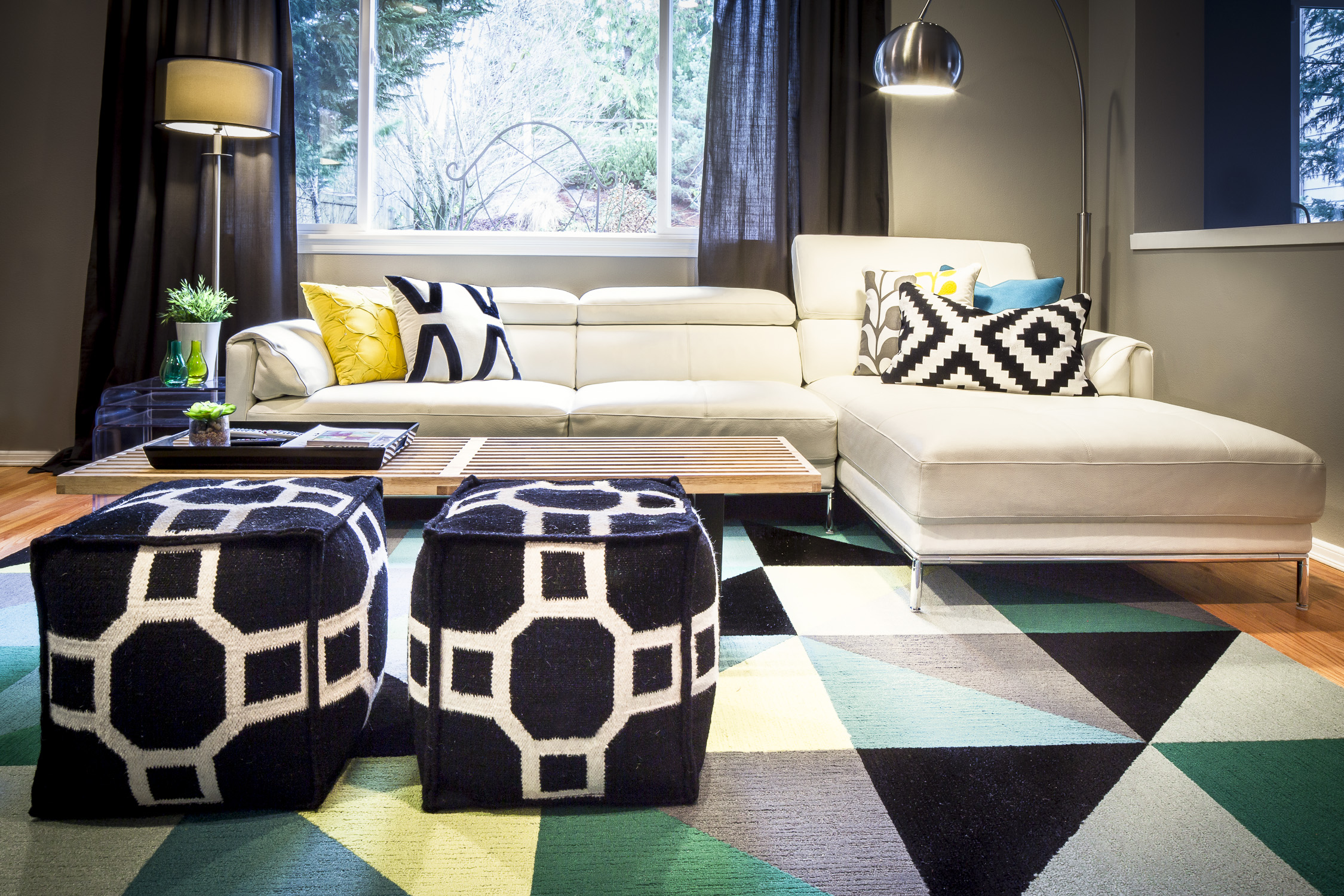
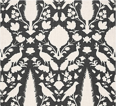
GLOBAL GLAMOUR
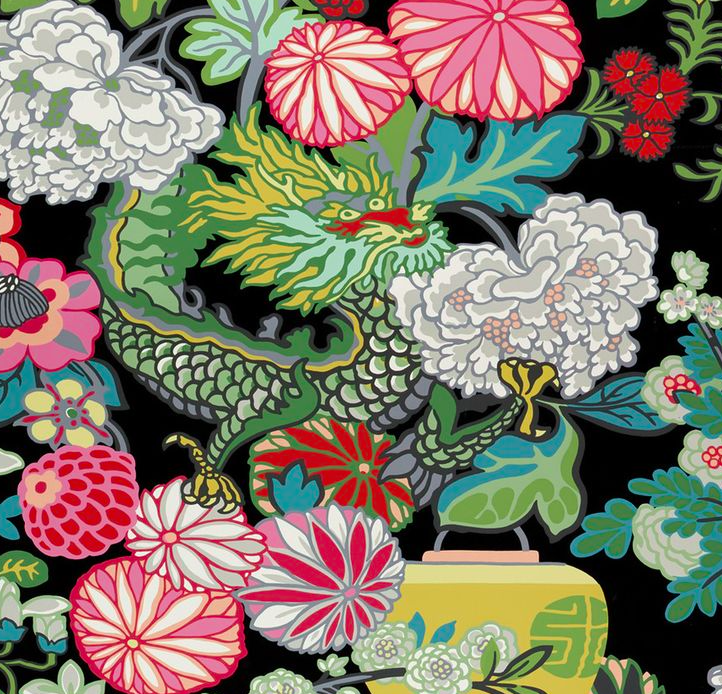
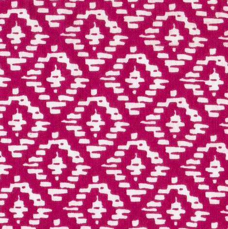
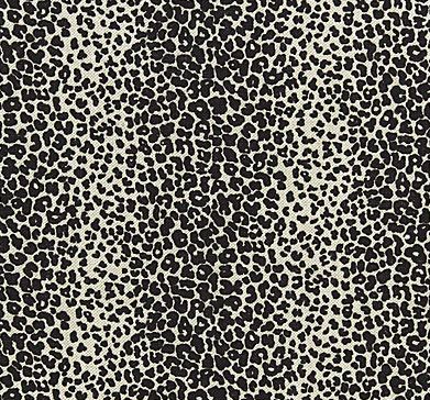
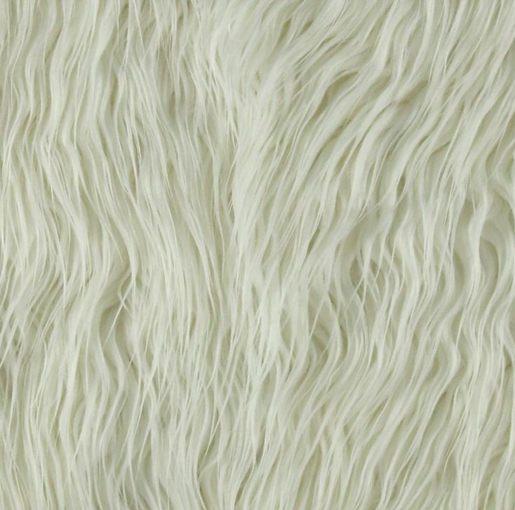
Time to play with some color! This whimsical print on fabric one is the epitome of a large scale pattern. It’s full of phenomenal color to pull from and makes a statement all on its own. I’m choosing my medium scale pattern on this eclectic ikat print. Because I’ve chosen such a bold color for my medium pillow, I love this small scale leopard print thrown into the mix! it ties back to the most dominant color in our first print, the black, but the scale is so much smaller, it could stand on it’s own with just our anchor pattern. Lastly, I figured we were having so much fun with this palette already, why not add a touch of the wild in there! I can’t get enough texture in spaces and sheepskin will certainly add a dollop of just that into your space.
Styling – If I were styling a sofa with this print palette, I’d probably go asymmetrical just to compound on the fun! I would do two large 22″ pillows in fabric one, and probably do a gorgeous gold welt just to amp up the eclectic vibe. I would do two medium 20″ pillows in fabric number two. I would do one 18″ in fabric number three an put it on the side of the sofa that makes the most sense to have visual weight on. Typically that’s the side thats nestled into a corner or has a large to medium piece of furniture to the side of it. Lastly, I would do a crazy, fun lumbar pillow in fabric number four and let it wander wherever it may!
MINIMAL MENSWEAR
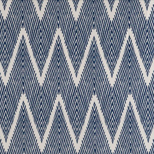
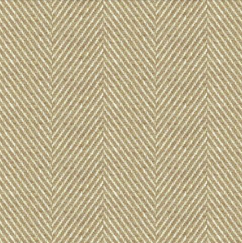
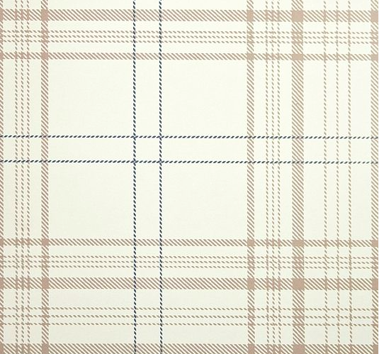
For me, when I’m working with spaces with a masculine feel to them, symmetry is everything. I feel that in some instances, symmetry can come across as boring, so selected powerful prints can make all the difference in the world. Fabric number one is an ikat inside of a chevron print! I love navy in this look, crisp and mature. The next pattern almost reads as a solid, but if you look closely, it’s a herringbone, which is where we capture our texture. I like this modern plaid in this palette because its lighter weight than so many plaids, but what says “mancave” more than a plaid?! It’s tonal values really tie all of the fabrics together brilliantly. Lastly, leather. Leather pretty much works in any space, but here, I think its going to serve as our perfect accent pillow.
Styling – I would lay this out much like our first palette. Two large 22″ pillows anchoring the corners of our sofa in fabric one. Two medium 20″ pillows in fabric two. Two smaller 18″ pillows in fabric 3 and finishing it off with a lumbar pillow in this delicious leather.
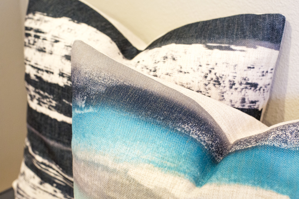
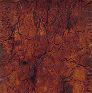
OUTDOORS OCEANSIDE
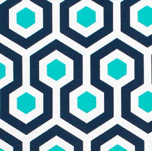

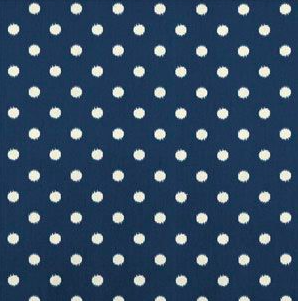
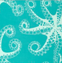
I love outdoor fabrics and actually find myself using them indoors as well, especially in homes with little ones! Again, these fabrics could all be mixed up in a variety of ways due to the size and scale of the patterns, but for the purposes of this blog, I’m suggesting that the first serve as your statement pillow. It’s a bold, fun, geometric print that would stand out as your largest pillow to anchor your patterns. I’m suggesting here a playful colored solid pillow to mix in. It gives an unexpected twist to the palette, but the jewel tones are all natural coordinates. The polka dot print serves as our small scale print. For me, a polka dot seems to work well with both geometric and more organic, curvilinear prints because they are structured and typically only consist of two colors. The fourth print here makes for an excellent accent pattern! It’s playful for your outdoor seating area and because it as well as the polka dot only consist of two color that are pulled from our anchor fabric, it won’t compete with the geometric pattern.
Styling – With outdoor spaces, there really are no rules! You could do your bench or chair cushions in any of these and any of them could be your lumbar pillows. You truly couldn’t mess this up, so have some fun!
So, there you have it! Mixing patterns 101, brought to you by us here at The Whitestone Design Group. We’d love of you to share with us what patterns your mixing. Drop us a line and send a picture to our email, hello@whitestonedesigngroup.com, or leave us a comment below. I you want more suggestions or styles you’d like us to touch on, let us know that as well! We aim to please.
heather scherie
For more of our latest projects, follow along on instagram at @whitestonedesigngroup. You can also follow along and see our latest curated collections @whitestonestyle.
whitestone design group 2020 | WEBSITE BY THE LOCAL FOLK | TEMPLATE by tonic |
Welcome to your story.
whitestone
206 486 5031
hello@whitestonedesigngroup.com
+ Show / Hide Comments
Share to: